Elements and Principles of Design
Elements and Principles of
Design
What are they?
Elements of Design are the parts
- They structure and carry the work
Principles of Design
- They affect the content and the message
Elements of Design:
Visual tools the artist uses
• Space * Line *Shape
• Form *Color * Value
• Texture
Line
• Is strokes that show motion and connecting two points.
• The artist Paul Klee said “
LINE WAS A DOT TAKING
A WALK.”
• It has five characteristics:
Length, width, curvature, depth, and texture
Shape
•
•
•
•
Is an ENCLOSED LINE.
It has HEIGHT and
WIDTH and is usually considered flat or 2- D
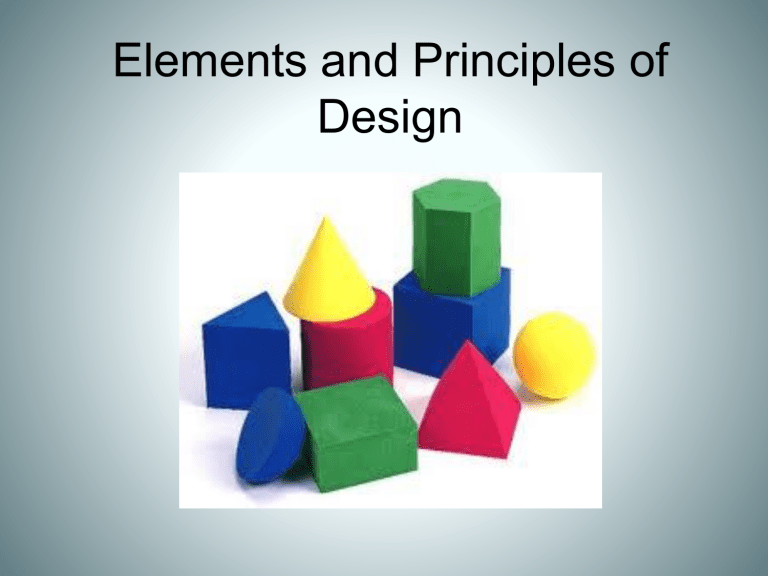
There are four basic shapes:
CIRCLE, SQUARE,
RECTANGLE, and
TRIANGLE
Two types of Shape
Geometric: Hard-Edged shapes such as squares, rectangles, circles and triangles.
Organic: A shape with smooth, curved lines, shapes and edges that resembles something from nature or life.
• Is TWO OR MORE
SHAPES COMBINED.
• It has height, width and
DEPTH.
• It is considered 3-D and usually you can walk around and/ or through it.
• There are four forms….
SPHERE, CONE,
CYLINDER, and CUBE
(which is man-made)
Form
Space
•
•
•
Is the AREA the artist works on.
It can be paper, clay, canvas, walls, etc.
It has two characteristics:
– POSITIVE… the object (the tree)
– NEGATIVE… the voided area surrounding the object.(the white)
Color
• common name of a hue found in or related to the color spectrum
•
•
HUE is another word for color.
There are:
– 3 PRIMARY colors
– 3 SECONDARY colors
– 6 INTERMEDIATE colors
* All placed evenly around the color wheel
Value
•
•
•
•
IS THE LIGHTNESS
AND DARKNESS OF A
COLOR OR NEUTRAL
GREY.
White added to a color is a TINT
Gray added to a color is a TONE
Black added to a color is a SHADE.
TEXTURE
• THE FEEL OF A
SURFACE.
– There are two kinds:
• ACTUAL OR REAL… usually made by nature
• IMPLIED OR FAKE…
Usually created by man.
Principles of Design
Directions for the Elements
• Balance * Movement
• Repetition * Emphasis
• Contrast
• Rythm
* Unity
Balance
• EQUILIBRIUM… the feeling of being comfortable in artwork. Where the elements are placed in the picture in a way so they have equal weight
• There are two kinds…
• SYMMETRICAL or formal balance which is objects centered
• ASYMMETRICAL or informal balance which is more objects on one side or off centered
.
Movement
• THE PATH OUR EYES
FOLLOW IN ART
WORK.
• Usually it brings the viewer in, around, and through the piece.
• Also known as
Rhythm
Repetition
• IS REPEATED
ELEMENTS… which is varied in size, shape or color
• Also known as pattern.
• DRAWING
ATTENTION TO
THE MAIN
OBJECT. All elements; like line, color, and shapes, direct your eyes to the main point.
Emphasis
Contrast
•
•
•
•
•
THE OPPOSITE OR
VARIED ELEMENTS that make an artwork interesting. Such as; color thick or thin lines, large or small shapes rough or smooth texture etc.
• ONENESS… makes all the elements and principles' work together to form a piece of art.
• Also called harmony
Unity
Rhythm
Lines, shapes, or patterns that create a feeling of movement
