ch2 - organizing and presenting data if you cant share your work
advertisement
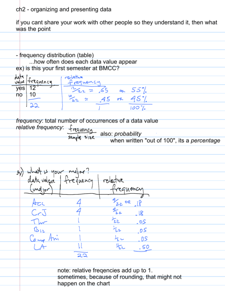
ch2 - organizing and presenting data if you cant share your work with other people so they understand it, then what was the point - frequency distribution (table) ...how often does each data value appear ex) is this your first semester at BMCC? yes 12 no 10 frequency: total number of occurrences of a data value relative frequency: also: probability when written "out of 100", its a percentage note: relative freqencies add up to 1. sometimes, because of rounding, that might not happen on the chart presenting qualitative data (words) Bar Graph ex) what is your major? ex) # of people in poverty in Lower East Side can include frequency labels to be precise -Pie Chart ex) # of people with a particular major label each slice with: category; freq (or relative freq or percentage) note: if the textbook asks "how many degrees in a slice?" ignore that - if you need to be that precise, use software presenting quantitative data a frequency distribution (table) looks the same when each data value gets its own frequency when might it look different? ex) what is your age? 31 19 22 33 25 32 22 51 21 20 21 22 31 26 43 break data up into data classes (from low to high) (what class you choose is up to you) here, break it up into 10s, 20s, 30s 40s 50s ...this is typical for dealing with ages each age range or "data group" is called a data class the class width is the distance between classes ex) here its 10 20-10=10 or 30-20=10 note: the class width must stay the same (in general) the class limits (or class boundaries) are the highest and lowest values in the class (there are other technical definitions for this, we will use this simple one) ex) what are the lower and upper class limits of the third data class? how do you make a frequency distribution table with continuous data? ...adjust class limits according to your precision (number of decimal places) ex) if you record people's ages with 2 decimal places (20.47years, 21.65, etc) then write your class limits with 2 decimal places: 10-19.99, 20-29.99, 30-30.99 etc - histogram ..bar graph for quantitative data # math classes note: there is no gap between the bars (some software programs get this wrong) what if each class contains several values? ex) what about a graph for relative frequency? note: for all these presentations, anywhere you put frequency, you can instead put relative frequency (you get same shape, 1 replaced by 1/15 ) what if your data has a big gap? ex) 19,22,56,20,21,27,32,22,47,25,24,42, 105,107,115,117, * frequency polygon (line graph) histogram, but instead of bars, connect points with a line 10 20 30 40 50 60 * cumulative frequency graph (ogive: "oh-jive") 19,22,56,20,21,27,32,22,47,25,24,42 great for small data sets: it is visual (like a histogram) and it preserves all your data ex) 105, 107, 112, 114 we can make: bar graph using Excel / OpenOffice / StatDisk pie chart using Excel / OpenOffice / StatDisk histogram using StatDisk there are lots of creative ways to represent data visually. want to see a better visual representation we can all use? how about this NYC subway map: http://www.kickmap.com/comparison/ for one guy, that creativity is his full-time job: http://www.informationisbeautiful.net/ this fellow tells the story of the world with animated statistics: http://www.youtube.com/watch? v=jbkSRLYSojo 2.4 misleading representations - a graph which is correct, but gives the wrong impression > 3-dimensional pictures exaggerate the appearance of change ex) money pile * misleading graph ex) salary graph "look at the raises we give!" short y-axis range - dont start from zero exaggerates change we can make: bar graph using Excel / OpenOffice / StatDisk pie chart using Excel / OpenOffice / StatDisk histogram using StatDisk
